You’ve found furniture you love and a rug and curtains and maybe even some cute little plants that bring life to the room. But now here’s a question: What to do about those blank walls? The answer is ART!
First and foremost, art should be personal and speak to you. When you see it, does your body have a visceral response? Can your eyes not stop starting at it in a good way? Art can be anything you love: old blueprints from a family home or vintage posters of places you’ve been or long to go. Even frame kids’ art in an important spot in your home. If you love it, then it will work in your space. This video shares three helpful tips when choosing art for your home. But it you don’t have a chance to watch, keep reading. It breaks down the three big things to think about when choosing art.
SIZE
Yep, when it comes to art, size does matter. This is the number one issue I see when I do commissioned paintings for clients. They have gigantic walls with tiny paintings on them. They say, “This just doesn’t feel right. I love this painting, but it just doesn’t work here.” Yep, it doesn’t work there.
It’s too small.
Here’s an example of what not to do:

An example of Art
that’s TOO SMALL!
This may seem super obvious but small paintings go on small walls. A piece of art should be at least half of the total wall space it is on. So let’s do some easy math, shall we? Your wall to the window trim is 90 inches. Notice I didn’t measure the entire wall, but just the space where the art was going to cover. I’m not going to put a piece of art over windows and curtains so don’t include them in your measurements.
90 inches/2 = 45 inches. Your painting should be at least 45 inches in length.
Another matter of size people are always wondering about is how high you should hang your painting. Artists and gallery experts have spent a lot of thought on this. Think about it, art is meant to be viewed. That is it’s main purpose so you want to make sure you hang it at the most optimal height for viewing on your wall.
Gallery owners say that you should hang your art 57 inches from the floor to the center of the painting. This way the main focal point of the painting will be at eye level for most and can be thoroughly enjoyed. If you’ve got some tall people in your house, you can always go up to 60 inches from the floor. Keep it in the 57-60 inch range.
Remember, when hanging art above a piece of furniture like a couch or mantle keep the bottom of the frame 6-8 inches above the furniture. Natural instinct is to go higher but then your art looks like it is floating and you have to tilt your head to really view it. Keep it eye level.
If you need a detailed guide on how to figure out the measuring and hanging specifics for your art pieces, here is a great one put out by Park West Gallery.
CONTRAST
The second thing to consider when choosing art for your space is contrast. This goes with the actual art piece and framing.
Here is an example of something that is kind of working but kind of not. It’s still a bit small for the space (only 40 inches instead of 45) and the tones of the art doesn’t really go with the dark gray on the walls.
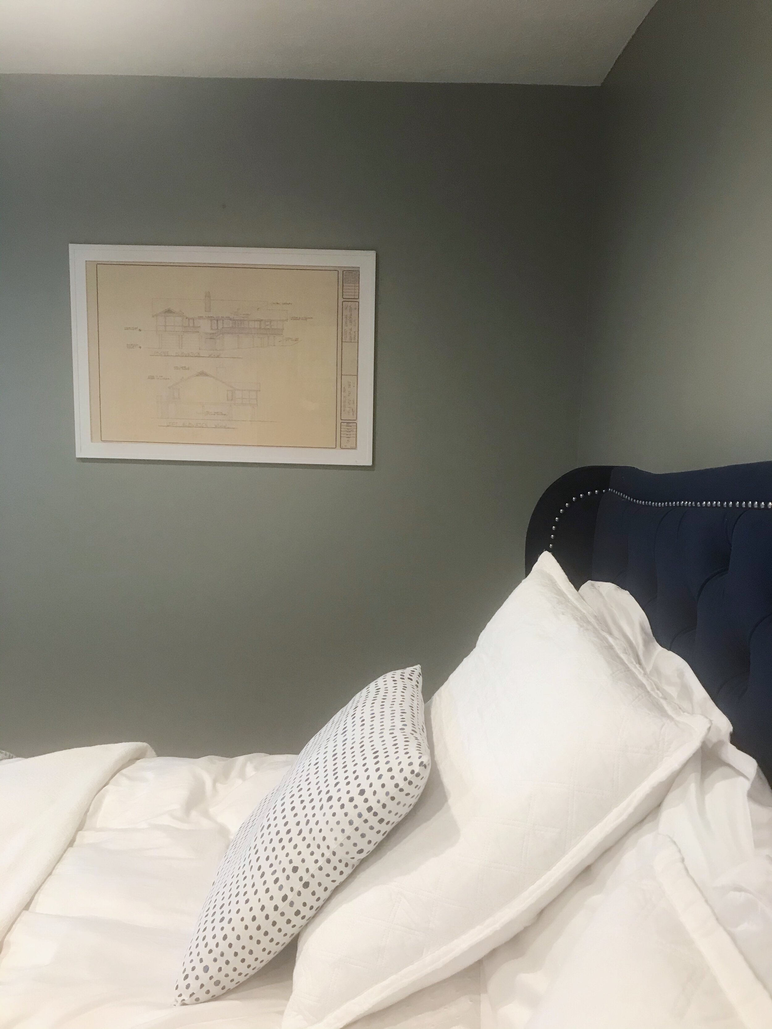
Example of Art
with not enough contrast
When thinking about contrast, take a photo of your space and turn it black and white. Does the painting stand out against your wall color or blend in? If the art and the walls are the same tonal value or the same shade of gray, that usually means there isn’t enough contrast.
So while I love this blueprint of a special family home, the tan paper and the gray walls are fighting each other. They are the same tone and just amount to blah. Up the contrast and choose something that gives some differentiation from your wall color.
The frame of this piece, on the other hand, works. The crisp white next to the dark gray walls adds crisp contrast and interest to the space. Right frame, wrong art for the space.
So as you choose art think about what color of walls it will be on. Is it dark or light? The majority of the art should be the opposite value of the wall to boost the contrast.
COLOR
The last and my favorite thing to think of when choosing art for a space is color!
While you don’t want the art to be matchy-matchy in your space, finding art that includes the colors in your room can really bring cohesion in a disparate space.
Take this painting for example:

I painted this one custom for the space because I really wanted these specific colors in my bedroom. Notice how I pulled in the gray from the wall color and the blues from the bed and curtains. It also checks the boxes for size (48 inches on a 90 inch wall) and contrast (it has plenty of white and light colors to balance the dark gray walls.)
It is more than okay (preferred actually) if a painting brings in other colors that aren’t found in the room. This room doesn’t have any coral (no yet anyway) or gold but adding them in to the painting bring balance and also variety to the space. Now, not everything is blue or gray. The coral is a nice compliment to the blue and makes it pop.

So when choosing art for your home think of three main things: size, contrast and color. Have fun and move your art around. You might be surprised that some pieces fit better in other spaces and you will fall in love with them all over again.
If you would like to know more about painting commissions, I’m your girl. I love to create personal and thoughtful pieces that reflect your personality. Please visit my website at brookeerinharris.com/commissions for more information.
Happy art choosing!